A collection of video production, motion graphics, brand identity, digital compositing, and enterprise systems — built across academic, client, professional, and personal contexts. The same instinct runs through all of it: build something that disappears into the background and lets the person in front of it shine.
Production systems built to solve real operational problems — designed for reliability first, with the same disappearing-act principle that runs through every other piece of work here.
A production .NET 8 Razor Pages application built on personal initiative to replace a legacy Classic ASP/Oracle platform that had reached end of supportable life. The system delivers real-time Overall Equipment Effectiveness tracking across active manufacturing shifts — giving operations leadership the visibility they needed before a planned QAD Adaptive ERP implementation could close the gap. Architecture, domain decisions, and deployment were handled end-to-end. The gap existed; the system filled it.
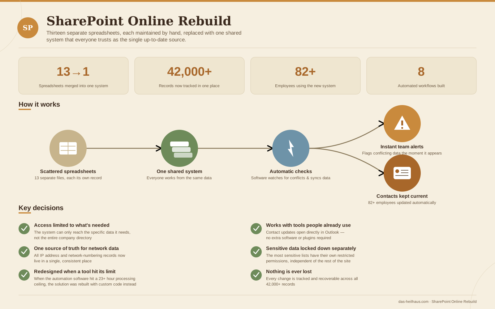
A sole-contributor platform migration: thirteen fragmented Excel inventories, each maintained by hand, consolidated into one governed SharePoint system that 82+ people now trust as the single up-to-date source for 42,000+ records. Automated workflows watch for conflicting data and flag it the moment it appears, and a companion contact-sync process replaced a manual, error-prone update routine. When one of the automated workflows hit a hard processing ceiling on a large batch job, the response was a redesign around a leaner, more targeted approach rather than continuing to force a tool past its limits.
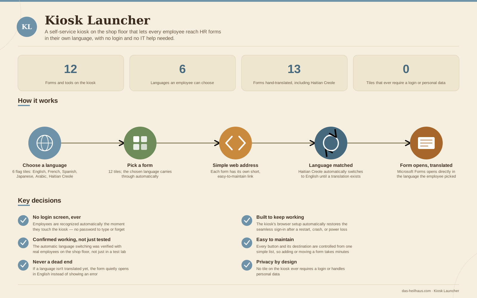
A self-service kiosk for the shop floor, rebuilt from an AI-assisted first draft into a hardened, production-grade system. Employees are recognized automatically the moment they touch the screen — no login, ever — then choose from six languages before reaching any of twelve HR forms and tools. Thirteen forms were hand-translated, including Haitian Creole, with a graceful fallback that quietly opens a form in English rather than showing an error when a translation isn't available yet. No tile on the kiosk ever requires a login or handles personal data.
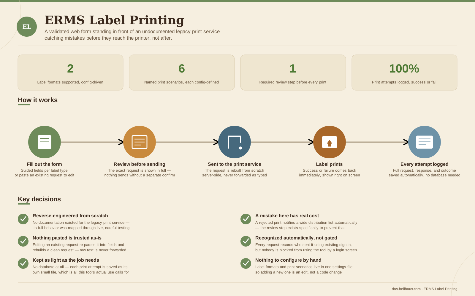
An undocumented legacy container-label print service, mapped end to end through live testing since no documentation existed for it, then wrapped in a small internal tool the IS team actually trusts. A guided form replaces manual, error-prone SOAP requests, and nothing ever sends until a mandatory review step shows the exact request first — a real safeguard, since a rejected print automatically emails a wide distribution list. Every attempt, successful or not, is saved to its own log file with no database required, since that's genuinely all this tool's usage pattern calls for.
{
"RequestedAt": "2026-08-26T09:14:02Z",
"RequestedBy": "DOMAIN\\jdoe",
"Layout": "ShippingContainer",
"LabelName": "TSTRIMCON — Non-EDI Printing",
"ServerPrinterId": "BCTC150",
"HttpOutcome": "Success",
"Successful": true,
"ErrorMessage": null
}Motion graphics, kinetic typography, and edited narrative work — produced under the SilencedDuality Production brand. Spans academic coursework from the B.S. Interactive Media Design program and client work for streaming content creators.
A three-act edited montage for a gaming streamer. Opens with a SilencedDuality Production sting, builds through rock-scored gameplay clips with rhythm-matched cuts timed to the musical drop, and closes on a single comedic clip that fades out on the streamer's laughter. The edit structure was deliberate: tension, release, humor — in that order.
A broadcast-style news intro sting transitioning to an anchor segment covering a fictional VR product story. Includes original voiceover recording, music selection, and motion graphics composition. Franklin University B.S. Interactive Media Design coursework.
A cinematic type-in-motion piece using a sweeping countryside pan as canvas. Folk-style score with movie intro typography treatment — text synchronized to music and camera movement. Explores the relationship between letterform, environment, and time.
Animated stream intro loop for a Canadian Twitch streamer. Blue flame composite on a maple leaf mark with a looping text transition between "Starting" and "Soon." Delivered as a WEBM optimized for OBS browser source integration — no additional setup required by the streamer.
Full brand systems designed for Twitch content creators — logo, OBS scene elements, animated notification overlays, and subscription badge tiers. Each engagement started with the same question: what does this person's identity look like as a visual system?
Full brand engagement for a Canadian Twitch streamer. The brief: build a visual identity from scratch that felt distinctly his. The answer was a maple leaf mark — a nod to his national identity — translated across a logo system, OBS stream elements, and a five-tier subscription badge system. Each badge tier is color-coded with a consistent medal ribbon device, creating a collectible hierarchy that rewards long-term subscribers.
Tier 1
Tier 2
Tier 3
Tier 4
Prestige
End-to-end streamer brand kit for a live broadcast creator. Includes logo design, OBS scene elements, and an animated notification system built around a parallelogram banner format with a starred icon panel. The defining motion element: neon glow borders with animated lightning coursing the perimeter on loop — delivered as WEBM files for seamless live OBS integration with no configuration required.
Photo compositing and digital illustration work produced under the ETH Customs and Team DART brands for the Android customization community — an era of online creative collaboration that predated the current creator economy by nearly a decade.
Distributed as device wallpapers and community assets, this work was built entirely through trial and error — no formal instruction, just tools, reference material, and iteration. The creative instinct was present before the vocabulary to describe it.
ETH Customs was a design alias developed for the Android customization community. A subsequent merger with fellow artists formed Team DART — Digital ART — expanding the scope of work distributed across the community. Later work migrated to the SilencedDuality alias, which carries through to the present day.
Every piece of work here — whether it's a broadcast sting, an animated overlay, a composited wallpaper, or a production tracking system — was built around the same operating principle: the work should serve the person in front of it, not call attention to itself.
A stream overlay that works perfectly is one the streamer stops noticing. A badge system that lands correctly is one subscribers feel rewarded by without analyzing why. An OEE system that does its job is one the production floor trusts without thinking about. The craft is in making the invisible architecture invisible enough that the experience is all that remains.
This is the same instinct that drives systems architecture, smart home design, and team leadership. The medium changes. The principle doesn't.